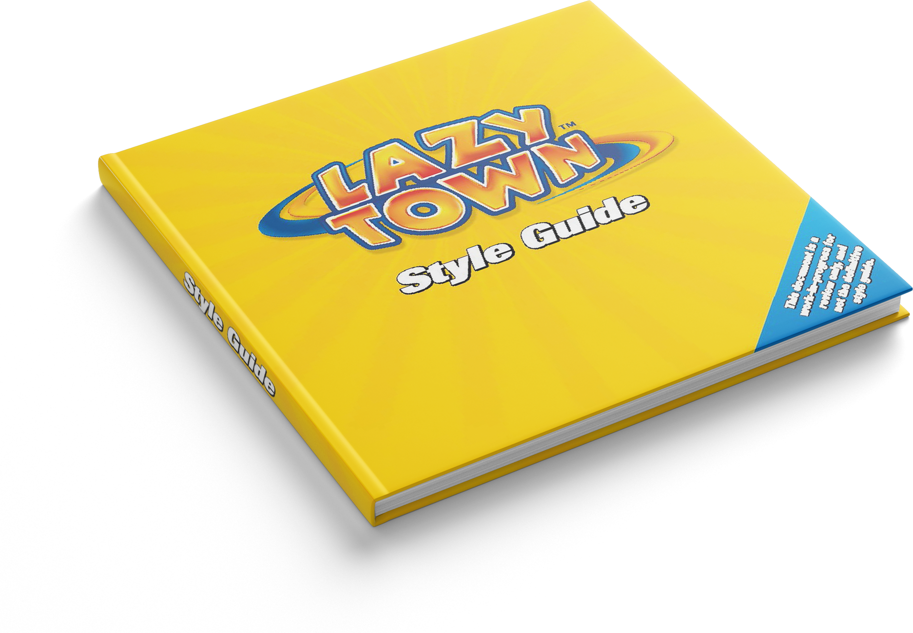
Styleguide
Version 2.0 of the LazyTown style guide. I was a big part of version 1.0 of the LazyTown style guide, both version 1.0 and version 2.0 were huge projects, the children show LazyTown was being viewed in over 100 countries.
My design department decided to upgrade the Style Guide, based on what we had learned from our first version of our guide. The task was very focused towards solving problems that version 1.0 had created. It's a learning curve when you are servicing over 100 countries with design material.
We had a base color scheme, which was the yellow tone, to give it the brightness and energy when it's displayed in a toy store.
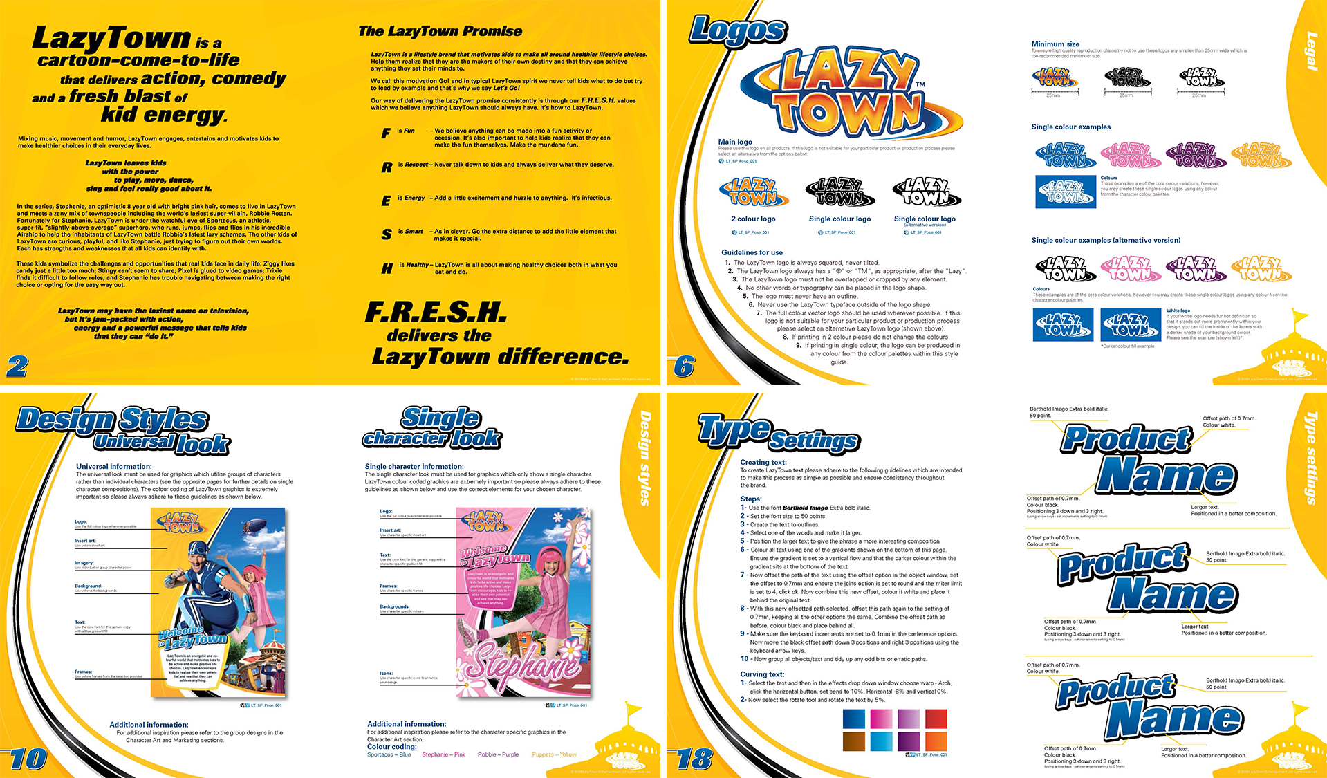
Our heroes had their own color schemes, to give them their special flair.
Stephanie
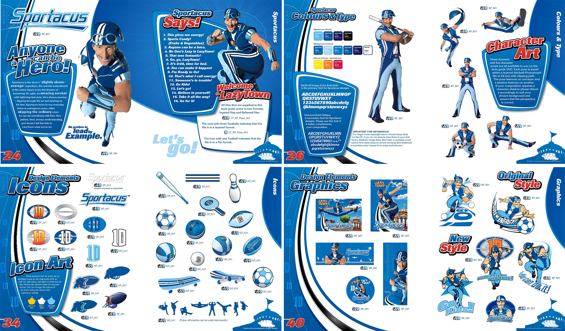
This is just a small demo of her graphical material.
This is just a small demo of her graphical material.

Robbie Rotten
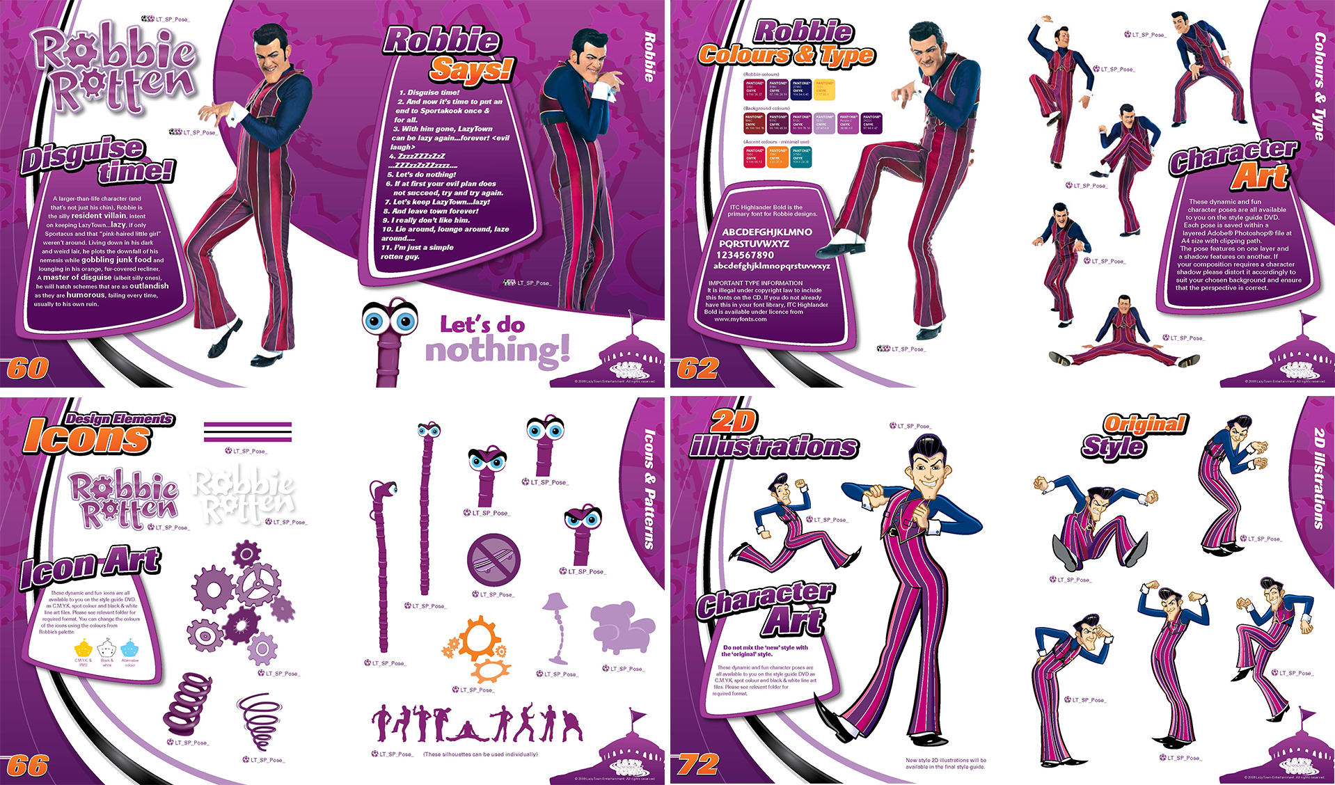
This is just a small demo of his graphical material. He was my favorite.
This is just a small demo of his graphical material. He was my favorite.
Other characters
They where less used alone in marketing material, so they had the overall yellow look.
They where less used alone in marketing material, so they had the overall yellow look.

Marketing material
Of course we created extensive material for marketing, this is just a very small part of it.
Of course we created extensive material for marketing, this is just a very small part of it.
